

One of the most daunting tasks for my clients is choosing a color palette. It's one of the first questions I ask, and it often leaves people speechless! That's ok! In fact, it can actually be a really good thing because it allows me to present some ideas and color combinations that my clients may not have even dreamed of!
Knowing the relationship that colors have with one another can help. Remember in elementary school when your art teacher pulled out the color wheel? Well, here it is again!
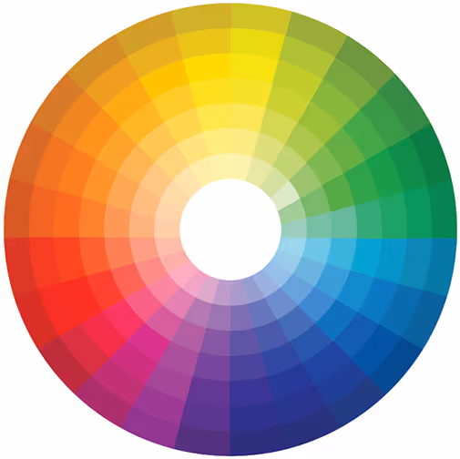
Just looking at the color wheel reminds us that there are warm colors and cool colors and that the possibilities are endless! You could have lots of fun with a monochromatic color palette. Or go with the golden rule that "opposites attract"
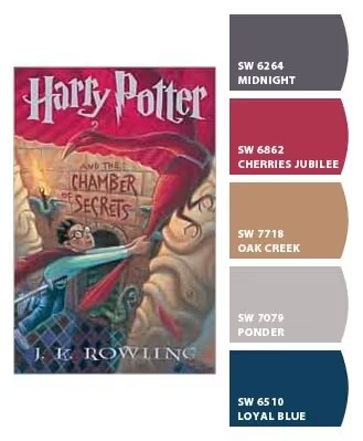
So where do you begin??? I recommend an inspiration piece, such as a piece of art, or fabric. Maybe it's the tile you fell in love with, or it could be a picture from your favorite vacation. Maybe you'll even draw from your favorite book! Take for example this Harry Potter color palette!
Whatever it is, your inspiration piece will usually clue you in on the colors you are drawn to and then it's up to your designer to help you bring it all to life!
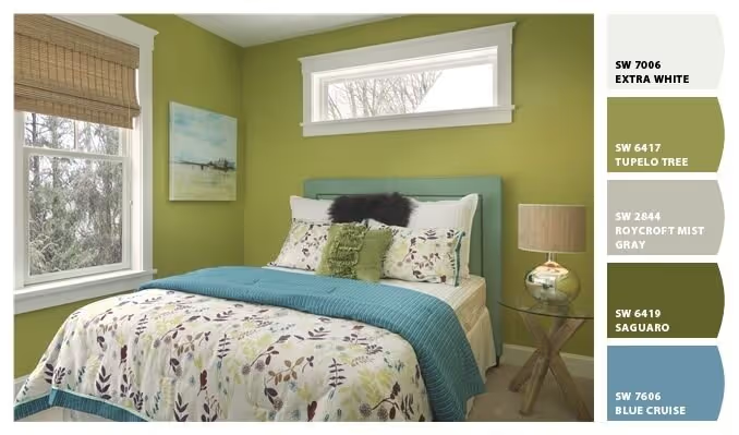
I've had a ton of fun lately using the Chip It app by Sherwin Williams. It takes a bit of the guess work out of choosing your colors. You simply upload a photo and it provides you with a color palette. Just bear in mind that your computer resolution may impact the color choices that Chip It provides. WARNING: The Chip It tool can be slightly addicting! You may find yourself spending hours uploading photos just to see what the paint choices may be!
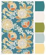
Take for example this fabric that I am in love with from Thibaut. I uploaded the image to Chip It and voila, here's what it gave me! Such a pretty palette that picked up on some of the more subtle colors in the fabric.
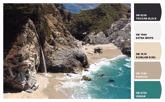
You can even use a photo from your favorite vacation. Here I took some inspiration from our 25th anniversary celebration. I love this romantic color palette, with so much meaning and heart behind it.
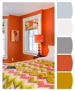
Here's a fun color combo for a teenagers room.
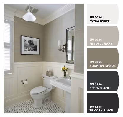
Even a neutral palettes need a little direction, like the one's pictured below.
Sometimes I find that the best color combinations are the ones that are most subtle. We designed this adorable cottage in Maine by using the gradient card from Sherwin Williams (you know, those fun little paint chips you can pick up at the paint display at your local store!). We started with Antique White (SW 6119) and ended with Craft Paper (SW6125)
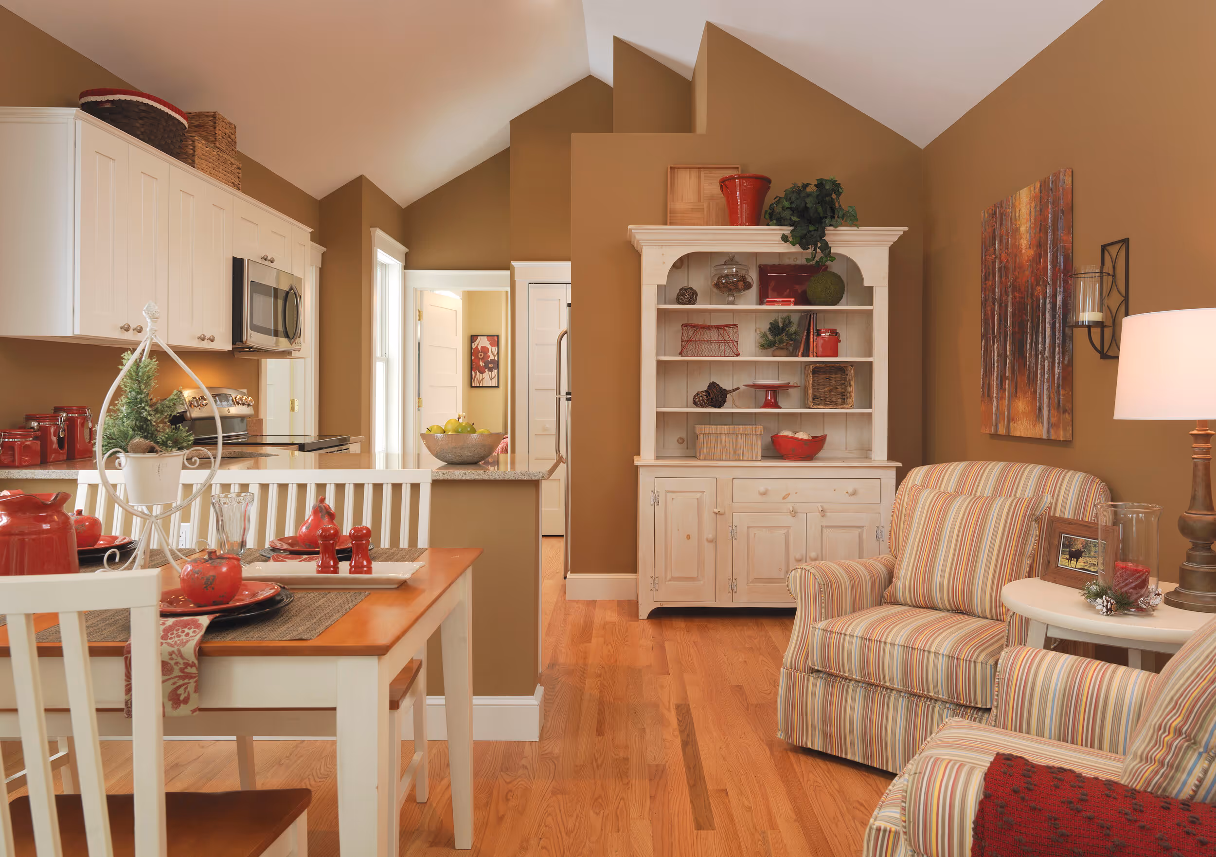
Because this room had such high ceilings, it allowed me to play around with dark and light, both with natural light and the lightening and darkening of the paint. Toasty browns are predominant in nature; soothing, comforting and grounding. They acted as a great base for the pops of red and made a little go a long way!
If you still aren't sure where to begin, hop on over to my Pinterest board, Colorful Combos, and discover the endless possibilities!
Renee possesses a rare combination of artistic creativity and intuitive design. Her warmth and compassion extended beyond working with us to understanding the style and feel of our home and how we live in it. We felt fortunate to work with and get to know Renee and absolutely love the updates she made to our home- from windows and walls to artwork and furniture!
Renee is an absolutely wonderful designer. Very talented and easy to work with! She will transform your room or outdoor space into exactly what you want, only better!
Talented, creative, dedicated, great communicator. Renee is such a special person.
We have worked with Renee Carman at this company for almost 2 years. Renee is professional, personable, and a pleasure to know. She is very helpful and will go the extra mile to please her clients. Renee has excellent expertise and knowledge of interior design. We have a beautiful home and highly recommend her.
Renee possesses a rare combination of artistic creativity and intuitive design. Her warmth and compassion extended beyond working with us to understanding the style and feel of our home and how we live in it. We felt fortunate to work with and get to know Renee and absolutely love the updates she made to our home- from windows and walls to artwork and furniture!
Renee was a pleasure to work with and has great vision. We were doing a total rehab of a recently purchased property and she was able to look at a gutted out '50s cottage and turn it into a beautiful mid-century modern home. She understood our budget and timeline and was good about narrowing all our options down to just a few choices. This expedited the process, made it less difficult and more enjoyable. Once the rehab is done, we look forward to working with her again and finish the rest of the rooms.
Renee at Mandeville Canyon Interior Design was simply wonderful to work with. She was able to understand what we were looking for in terms of color, function and design from the moment we first spoke. She's easy to work with, goes above and beyond and delivers an outstanding design.
I highly recommend Renee and Mandeville Canyon Interior Design. I don't think I will attempt to decorate another room in my house without the help of Renee!
Love working with Renee and Mandeville Canyon Interior Design ! I had the opportunity to collaborate on a large scale design project recently and the results were fantastic! Creative, resourceful and one of kind design ideas made this design opportunity with Renee "one of a kind" Have a large or small project? You won't be disappointed!!
Renee not only has an amazingly creative eye, she also directed a massive renovation for us this past year that included the challenges of operating during the pandemic. She put together a team that had an incredible work ethic and brought the project in on-time and on-budget. She's a great listener. When we threw ideas at her, she was never dismissive; quite the contrary, she made them better. Her patience, attention to detail combined with her whacky sense of humor meant we were all able to smile while producing a home that we love. A great talent and a great lady.
Rene is amazing! Great customer care and wonderful attention to detail.